Overview
Easily build your UI
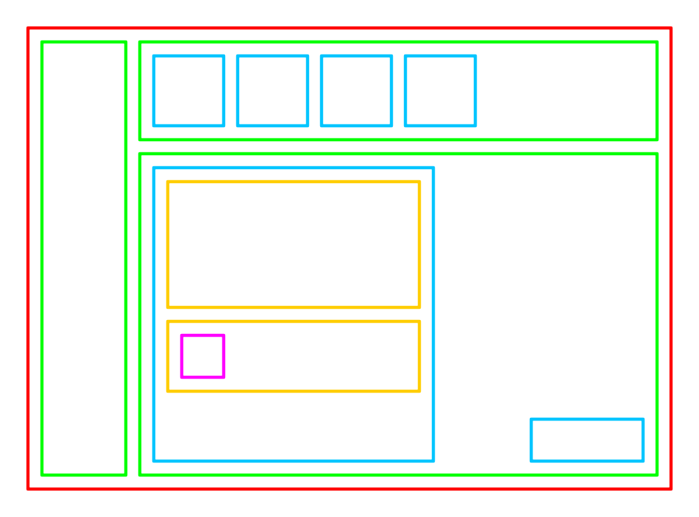
Goblin-gadgets contains a large collection of standard widgets, allowing to
build complex UI easily and quickly. The secret is in the boxing, each box can
hold other boxes, and so on. The boxes are called container and they are
always rectangular.
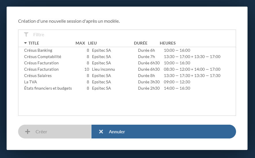
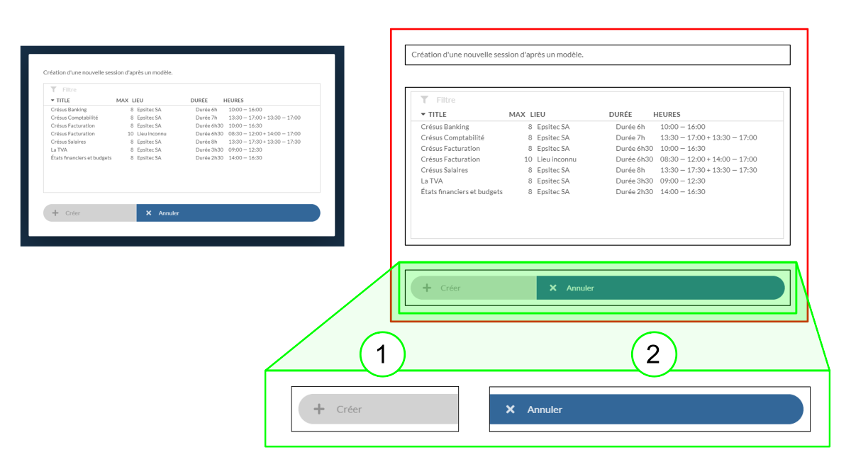
Here is an example of a dialog:
Highlighting in red shows a container that contains 3 parts. Each part is
itself a container.
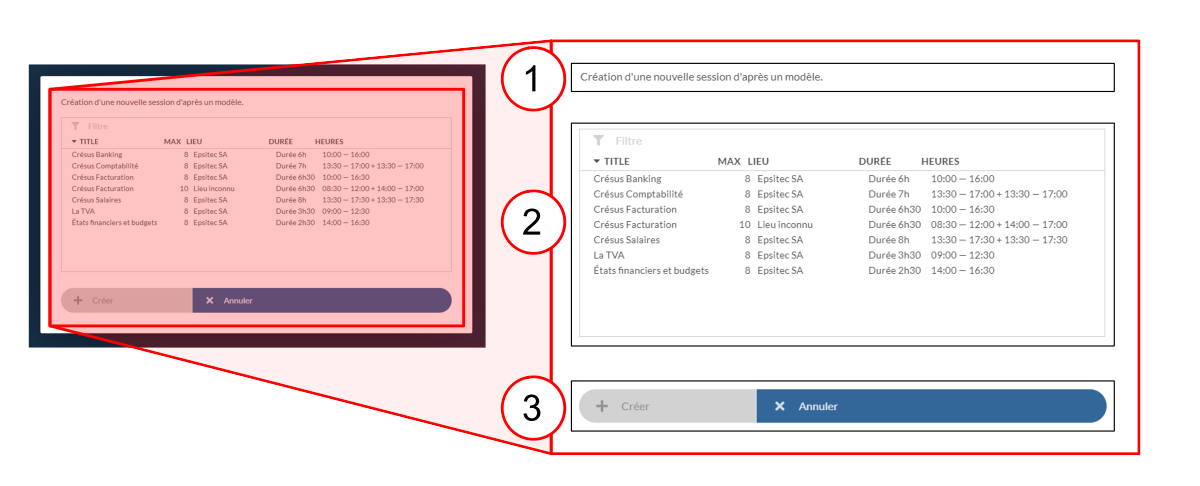
The bottom container (3) contains 2 buttons:
Info
We sometimes use the term component, which is synonymous
with widget.
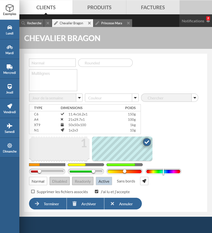
There are many widgets, for all common uses:
| Widget | Function |
|---|---|
Button |
Action button |
Calendar |
Complex calendar to choose a date |
ColorPicker |
Choosing a color (RGB, HSL, CMYK or grey scale) |
Gauge |
Displays a progress |
Label |
Static text |
Slider |
Entering an analog value |
Splitter |
Split content into 2 parts |
Table |
List with header, rows and columns |
TextInput |
Free text input |
Ticket |
Ticket shaped container |
Tree |
Tree list |
| usw. |
container is itself a widget that contains child widgets:
<Container>
  <Label />
  <Button />
</Container>
Properties
Each widget has a wide range of properties, which determine its appearance and
behavior. For example, the widget Button has a property kind which defines
its appearance:

The text property determines the name displayed in the Button:
<Container>
  <Button kind="action" text="Clear" />
  <Button kind="task-tab" text="Home" />
</Container>
The container component has a property that determines how its children are
arranged (in row or in column):
<Container kind="row">
  <Label text="What action do you want to take?" />
  <Button kind="action" text="Save" />
  <Button kind="action" text="Cancel" />
</Container><Container kind="column">
<Label text="First line" />
<Label text="Second line" />
<Label text="Last line" />
</Container>